
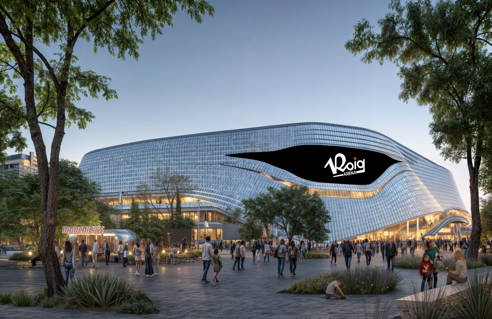
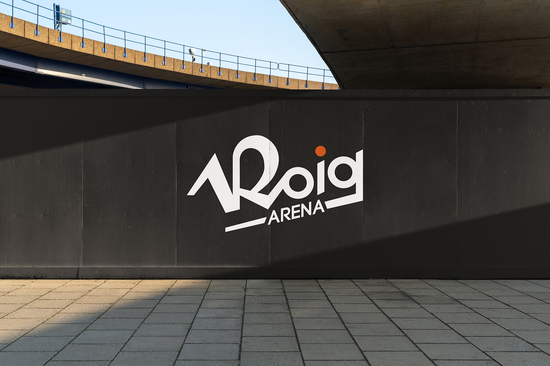
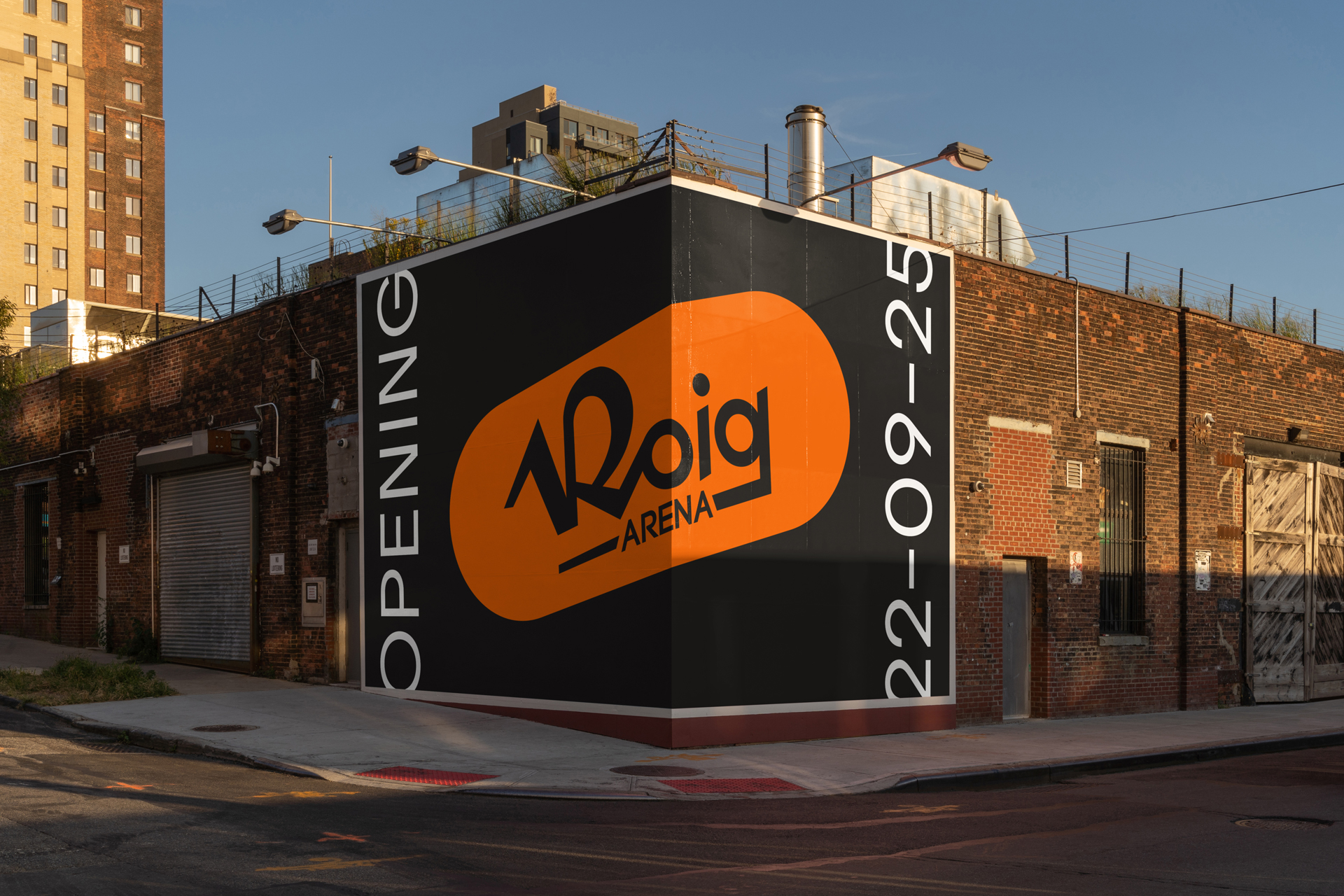
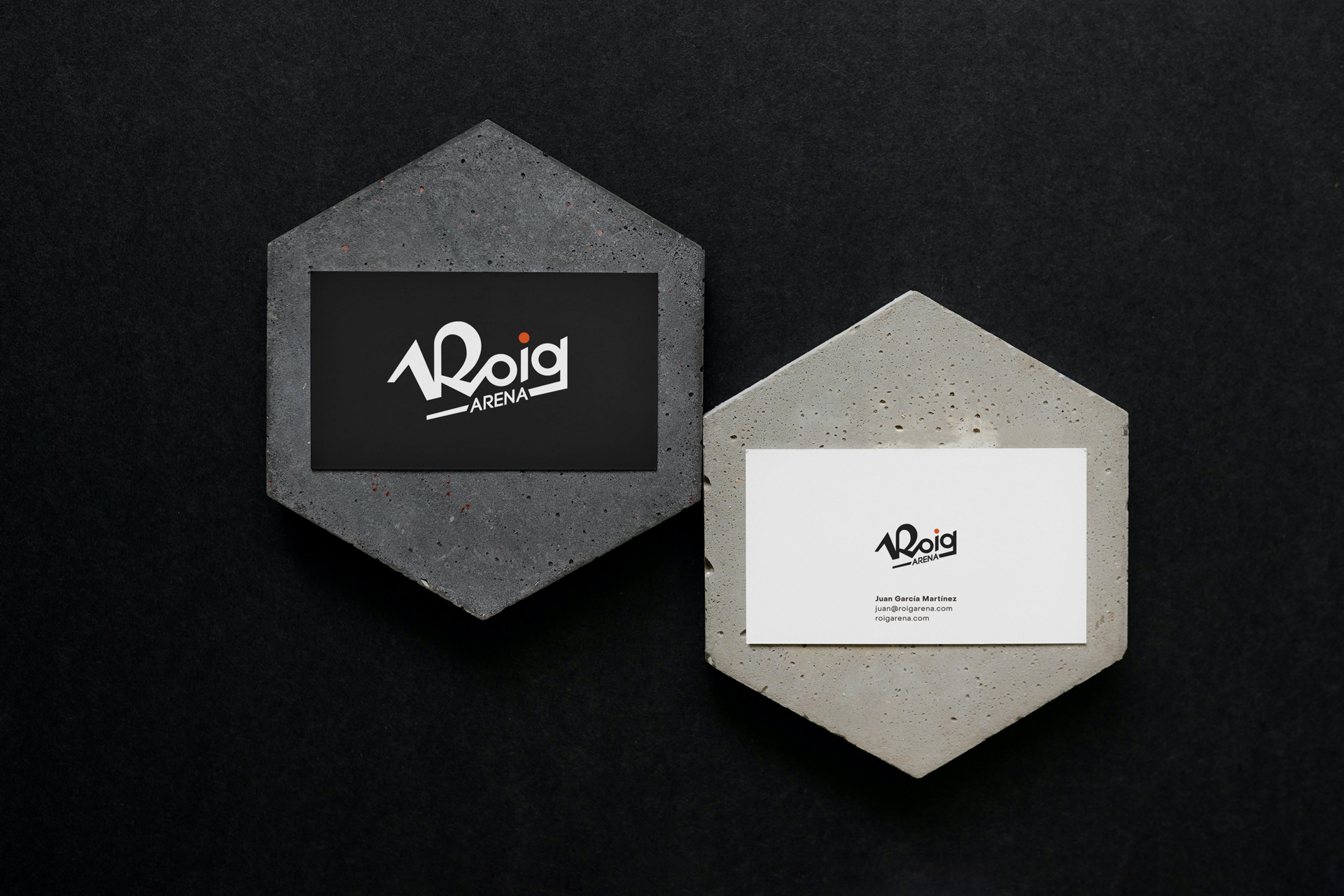
Roig Arena
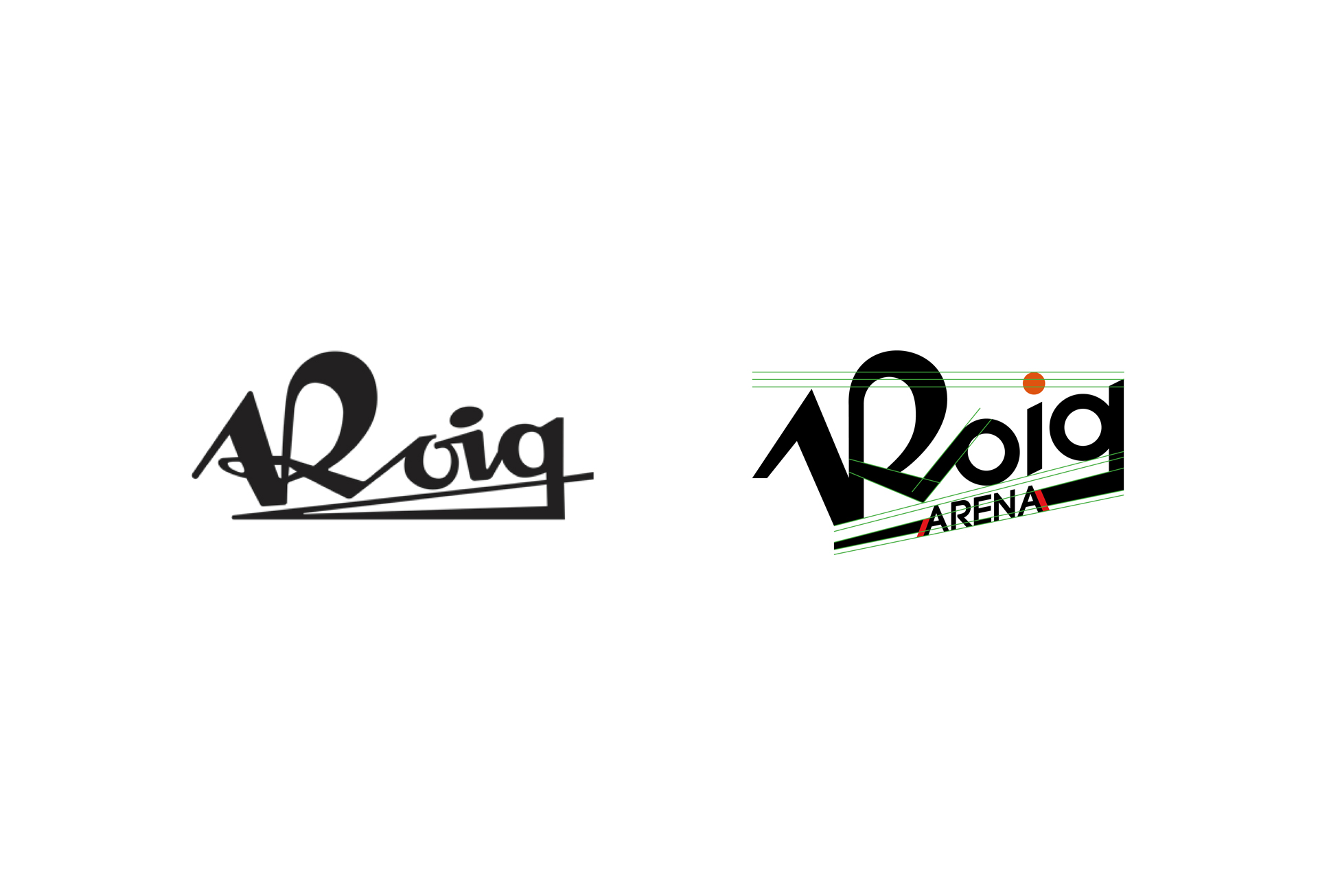
After winning a competitive agency pitch and designing
an initial logo inspired by the architecture and configuration of the new Roig Arena, we were tasked with taking a radical turn. The brief was to create a new graphic identity that faithfully reflected the original essence of Roig’s business:
Industrias Cárnicas Roig* (Roig Meat Industries).
The request was crystal clear: "When we see the logo,
we must immediately recognise the brand that represented the family’s first business."
With such a specific brief, the challenge lay in ensuring that
a brand from the 1970s could resonate and function seamlessly in 2024.
*Juan Roig is a prominent Spanish businessman, best known as the owner and president
of Mercadona, one of Spain’s largest supermarket chains. His business interests span multiple sectors, including retail, real estate, and sports. The "Roig Arena" is one of his recent high-profile projects, showcasing his growing influence beyond the grocery sector.
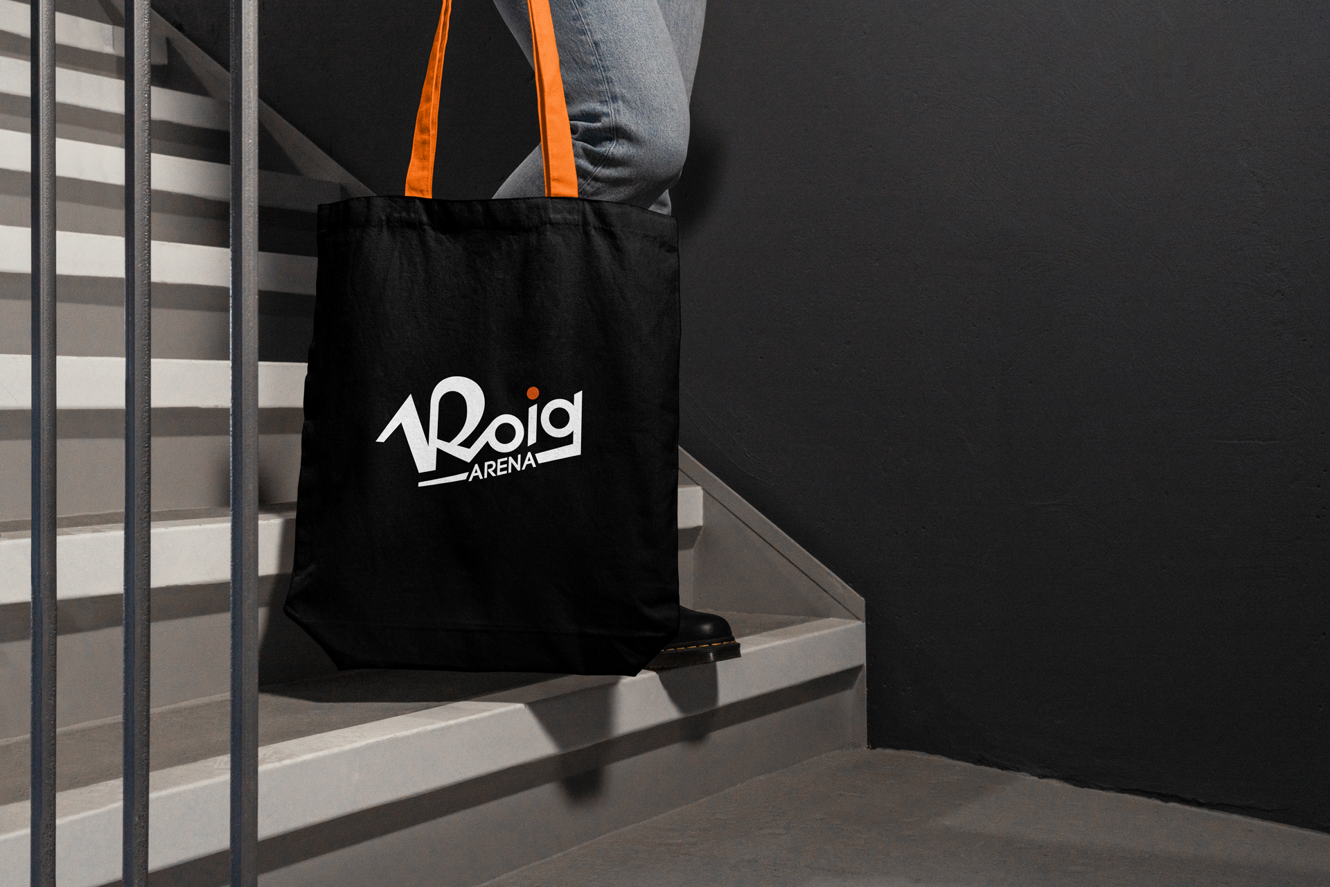

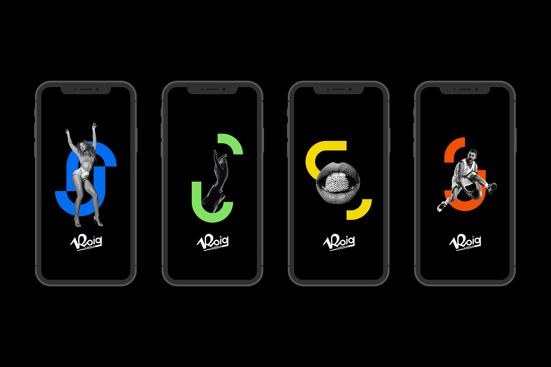
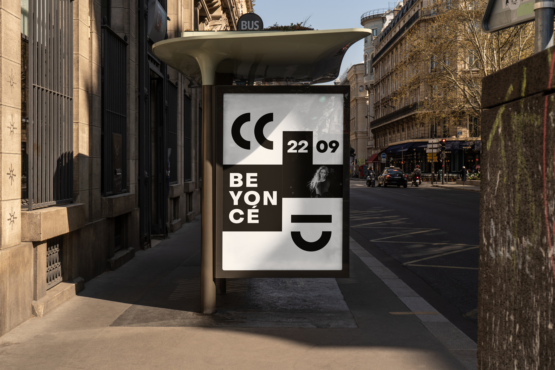
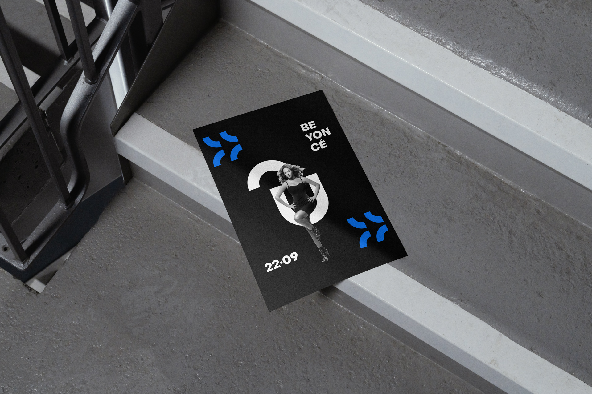
Pictograms
Based on the geometry of the logo
and the architecture of the stadium,
I designed a series of pictograms
to enhance the brand's identity,
making it both visually relevant
and contemporary.


Client: Licampa / Roig Arena
Agency: La Mujer del Presidente
Role: Concept / Brand Design / Art Direction / Creative Direction